


A refreshingly reimagined rebrand for a stereotypically staid sport
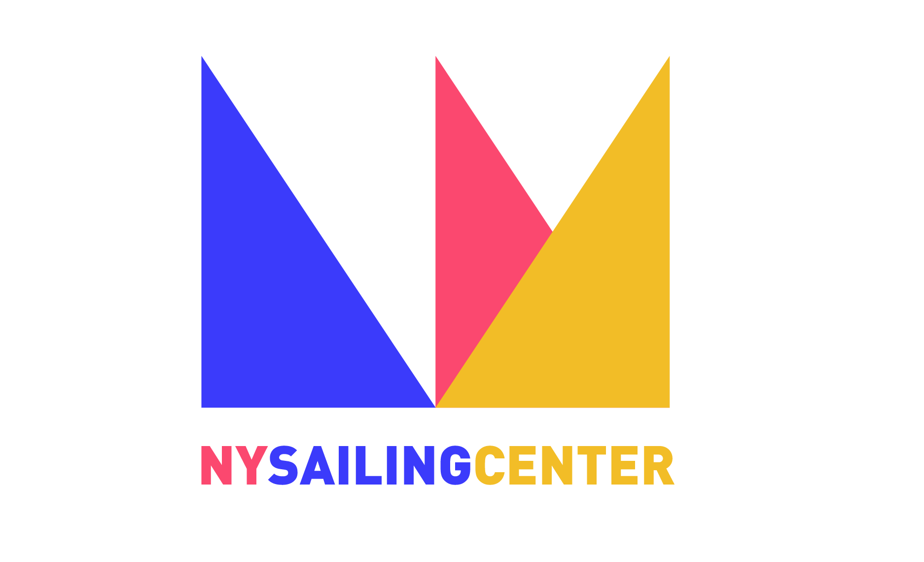
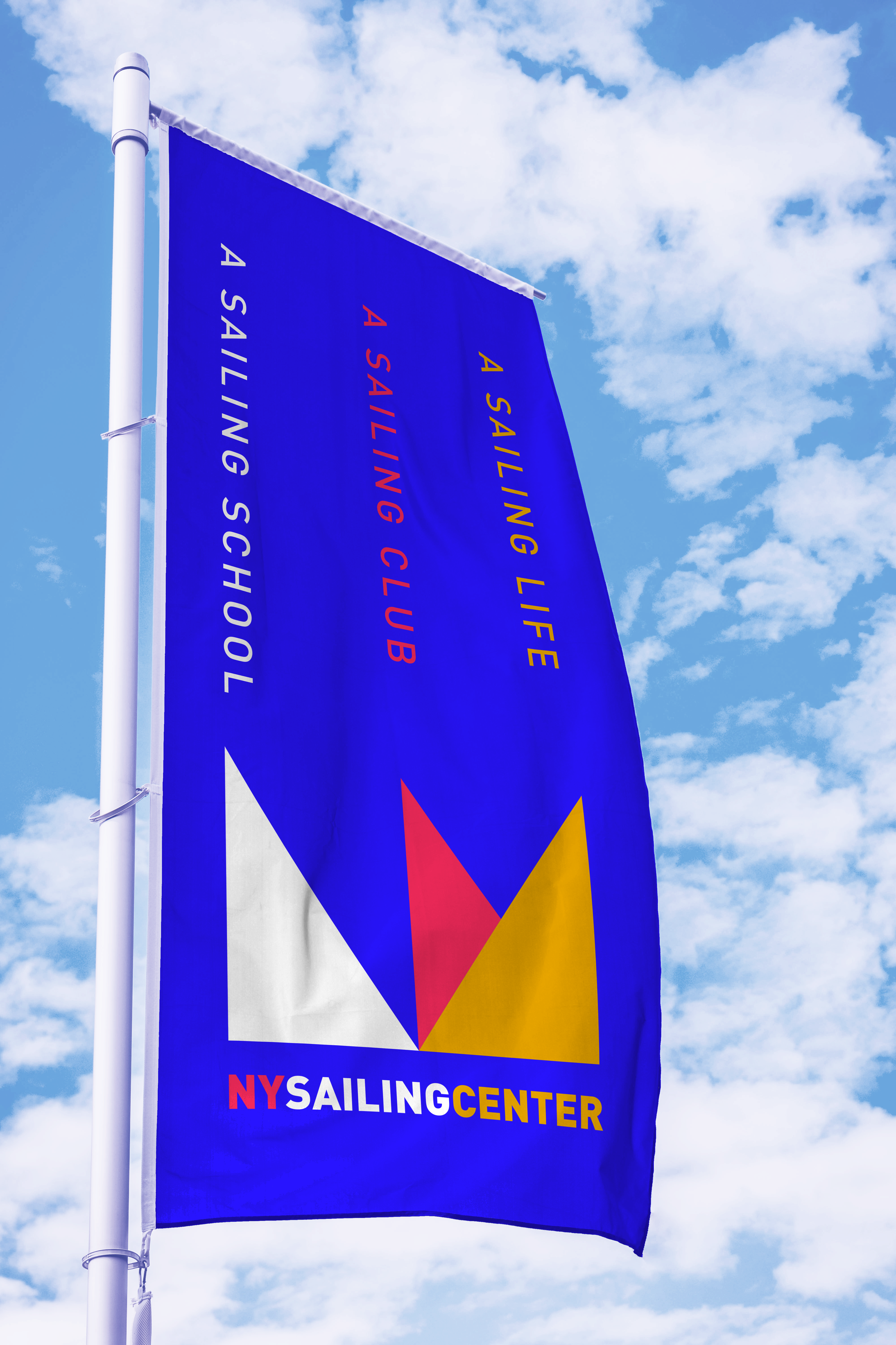
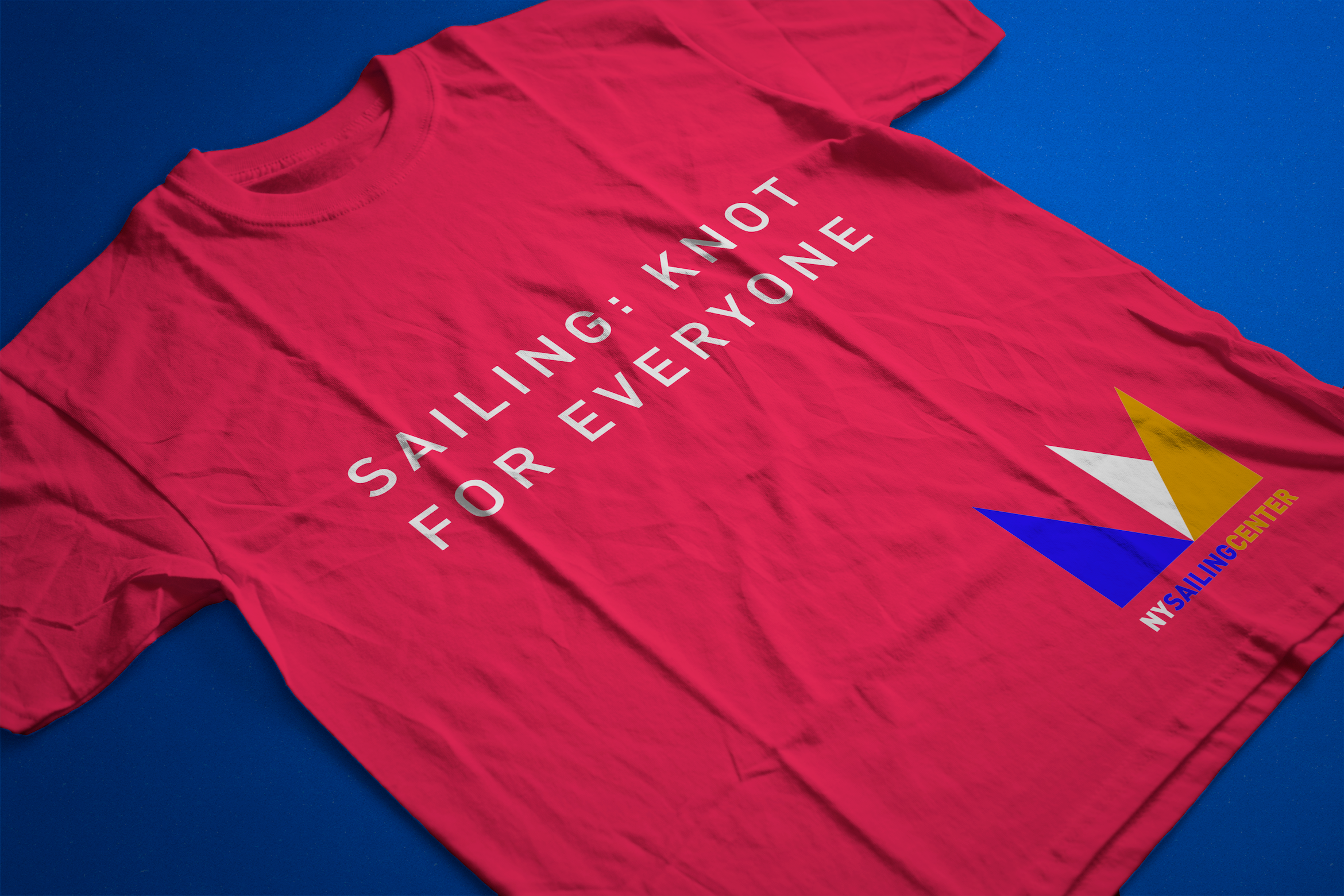
As an avid sailor, I’ve seen my fair share of boating and yacht clubs — each indistinguishable from the next, showing endless iterations of staid and stodgy navy blue branding. New York Sailing Center wanted a fresh take on its brand, and a break from tradition. The logo may be seen by some as an abstract, distinguished crown. Others see three colorful sailboats crossing in the water. Especially perceptive viewers will see a stylized ”NY.” The colorful identity takes its cues from nautical flags used in navigation.
Roles
Copywriting
Design
Art Direction
Creative Direction
Agency
MSLK


work