


A logo created for a premium cable brand continues to endure
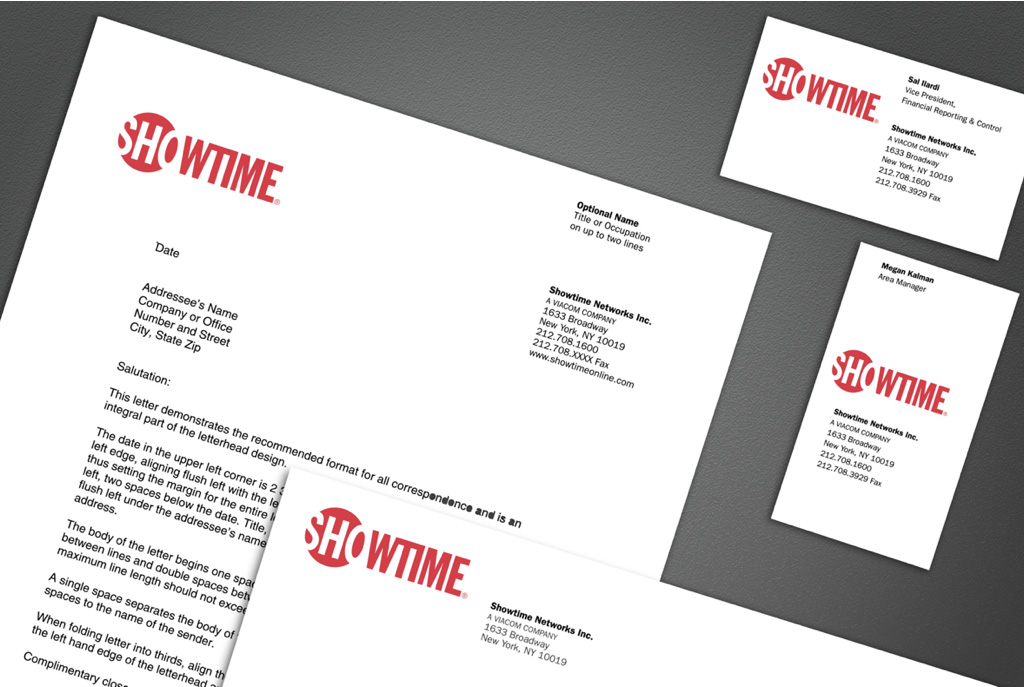
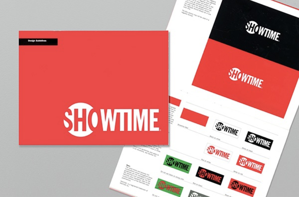
In 1997, while working for design legend Ivan Chermayeff, I was tasked with creating design solutions in tandem with him for Showtime Networks. The goal was to feature the call letters “SHO” with and without the whole word. A spotlight theme was explored, emphasizing the performance aspect of the name. Ultimately, my design was chosen for its efficient use of positive and negative space. This allowed the letters “SHO” to be as large as possible. I also created the graphic standards manual detailing Showtime and its various sub-brands across a variety of materials.
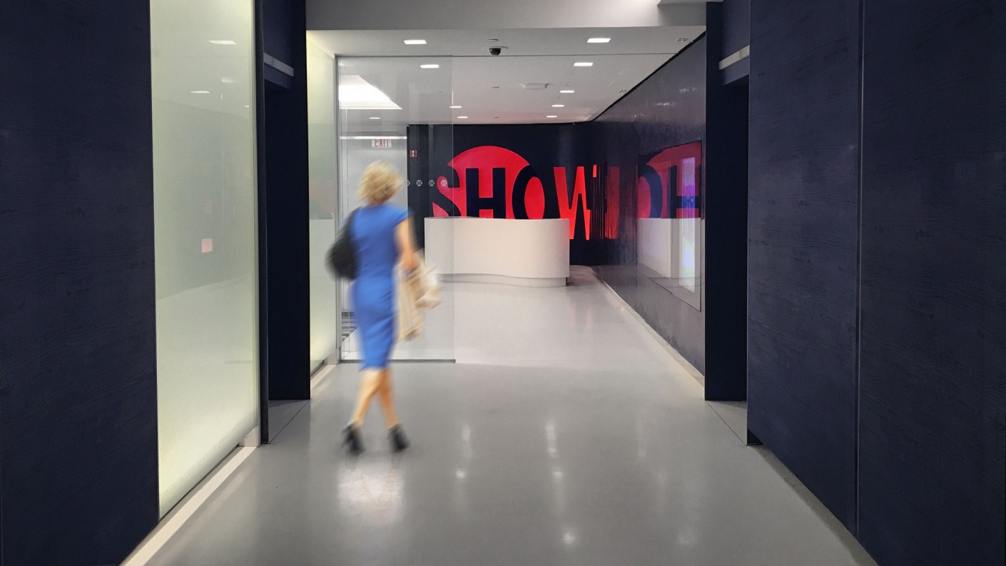
Twenty years later, I’m delighted to see the logo still in use, animated in new and innovative ways.
Project
Showtime Networks Brand Identity
Agency
Chermayeff & Geismar
Role
Designer


work